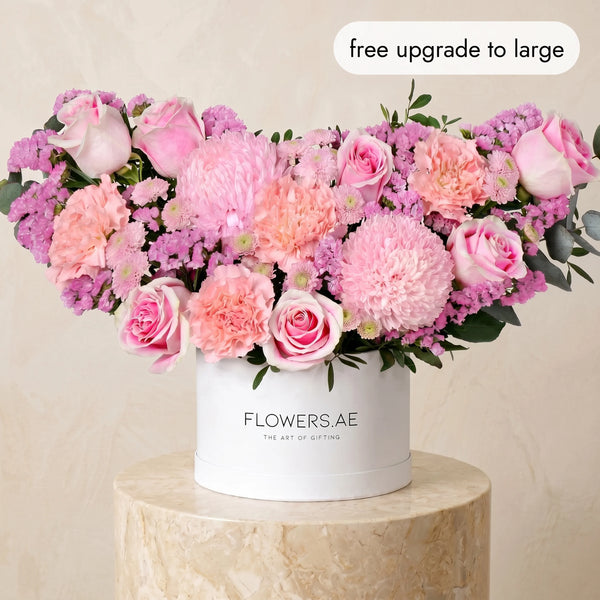
Pale pink into deep rose
The most restrained of the four, and the one that suits a pared-back interior best. It opens at the palest blush and travels through to a rose so dark it reads almost brown in low light, with autumn foliage running through to keep it from feeling like spring.
On a console table or across a long dining table, it holds its own without asking for the room. This is the palette for a space that is already doing the talking.
Pale peach into burnt orange
The clearest autumn statement we make. Pale peach at the outer edge, deepening through apricot into a burnt orange at the centre.
It is warm in the literal sense — it changes the temperature of a room. Which makes it best in the kind of space most of us live in here: pale stone, glass, marble, a great deal of white. The contrast is the whole point.

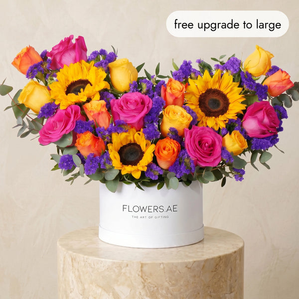
Pale peach into yellow and gold
Softer, and the most generous of the four. Peach lifts into yellow and gold rather than deepening into red, which gives it a brightness the others do not have. Sunflowers sit at the heart of it, and they are why it reads as abundance rather than restraint.
Of the four, this is the one for a family home. It photographs well in daylight and, more to the point, it holds up under it.

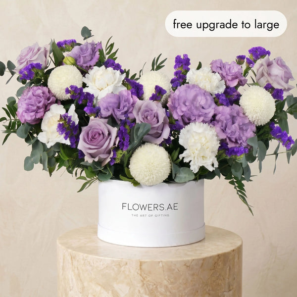
Light purple with autumn foliage
The unexpected one. Purple is not the colour most people reach for in autumn, which is exactly why it works — soft lilac deepening into aubergine, with autumn leaves grounding it so it never turns sweet.
This is the palette for a home that has already been thought about. It rewards a second look.

What holds it
Colour is half of the decision. The vessel is the other half.
Black hatboxes are the sharpest choice we offer — a hard, matte frame that makes a warm palette look deliberate rather than seasonal. The pink-to-rose and the purple are strongest here.
Ceramic vases are the quietest, and the most permanent. They stay in the room long after the flowers have gone — and with a 7-day freshness guarantee, that is longer than most people expect.
Hand-tied arrives finished, arranged and tied by our florists. It needs only a vase and water.
Domes hold a gradient better than anything else, because the shape lets the palette read from every angle.
Large baskets are the generous option. The one to send when the gesture should be visible from the doorway.

Choosing for someone else
If you are sending rather than keeping, the palette matters less than the room it arrives in. A pared-back apartment takes the pink. A warm, layered home takes the peach and gold. And when you do not know the space — which, more often than not, you will not — the black hatbox settles it. It looks considered anywhere.
Every order is approved by video before it leaves us, so the palette you choose is the palette that arrives — whether it is going to an apartment in
Dubai or across to
Abu Dhabi.
Explore the Autumn Collection →